You can view data in a tabular format rather than as a chart. Create a table from an existing visualization, or make a new one.
Tip: Switching to table mode on an existing
chart allows you to preview the underlying data.
Topics on This Page
Create a Table From a Visualization
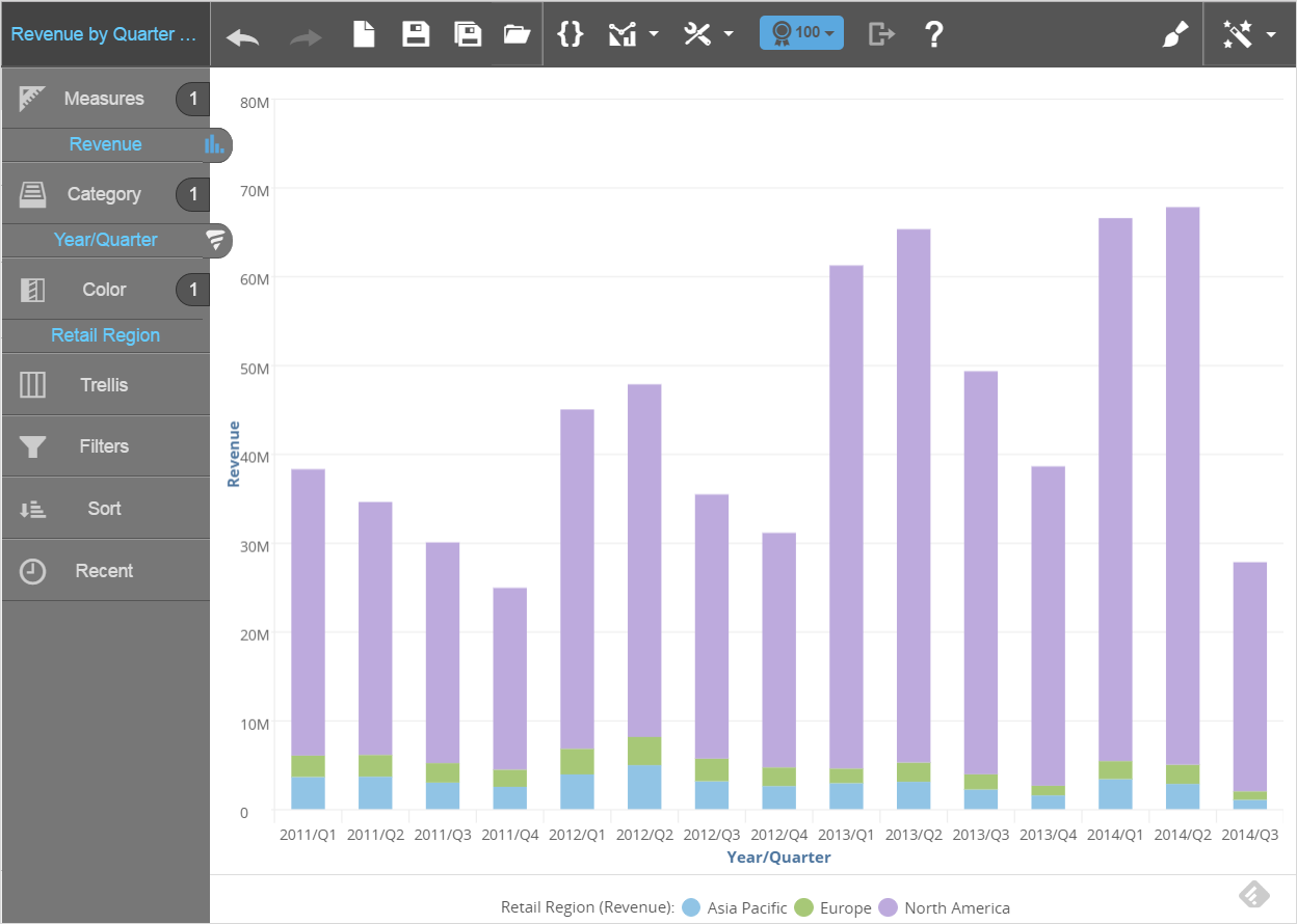
- Open an existing
report.

- In Guided Mode, select table. Visualizer converts the existing
chart to a table.

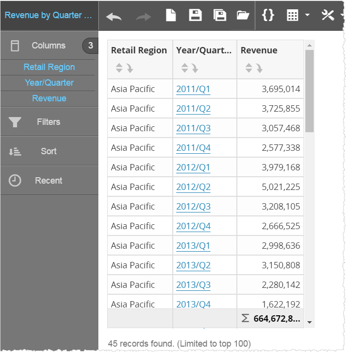
- Click Save As and save the table with a new name.
- Continue formatting the table.
Create a New Table
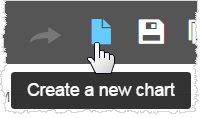
- If Visualizer is not already empty, click Create a new chart.
- From Guided
Mode,
select table. The Chart
Builder prompts you to add attributes and measures.
For tables, all measures and attributes are put in the Columns section.
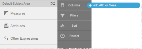
- Drag and drop
measures and attributes to the table from the Subject Area.
- Click Save to name and save the new table.
- Continue formatting the table.


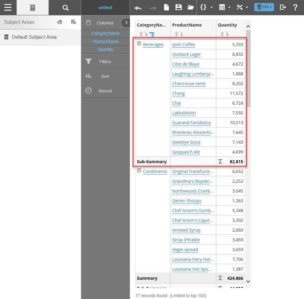
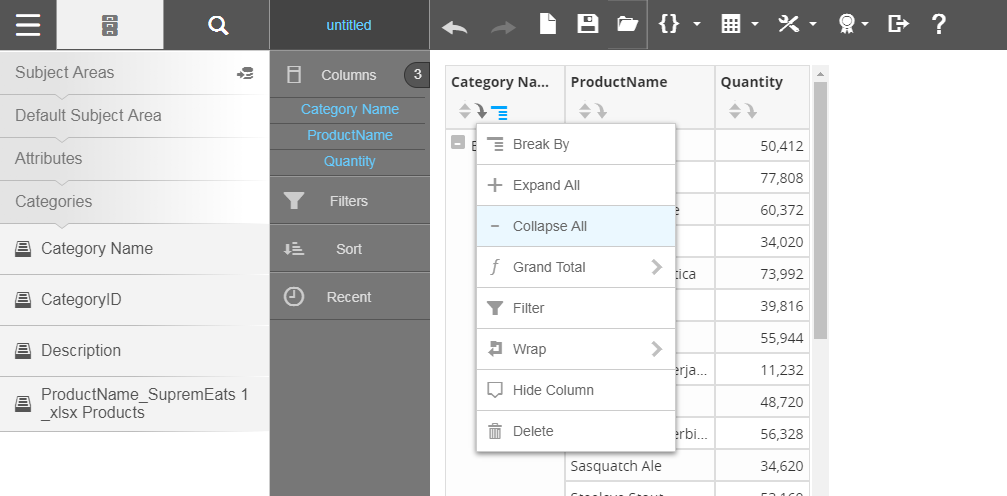
Create a Break By Report
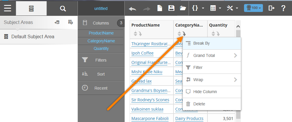
- Select the column attribute for which you want to create sections.

- Click the down arrow to view additional actions, then select Break By. The report creates a subsection based on the selected Break By attribute.
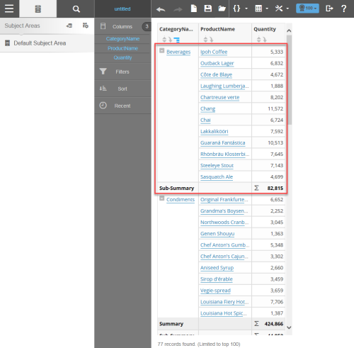 Note: You can expand and collapse all Break By sections.
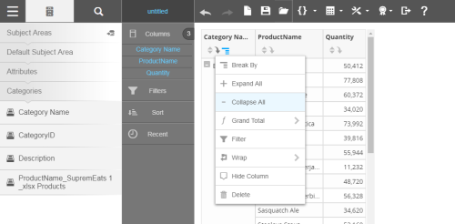
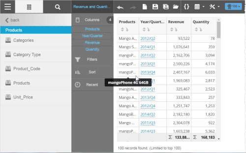
- Below the table, Visualizer displays the number of returned rows.
- By default, Visualizer limits the number of rows to 100. This is for convenience while designing as well as for performance reasons. You can change this in the Top N Results menu.
- When there are many rows in a table, Visualizer automatically adds a scroll bar. The size of the scrolling area is based on the size of your browser window.
- By default Visualizer adds a Grand Summary at the bottom of measure columns. To enable this option, click Table Settings → Grand Summary → Column Summary.
- If the text or number in a column exceed the column width, you can hover over the column and a tooltip displays the full text or number.
- Visualizer has a limit of 50,000 rows for tabular data.
Tips: